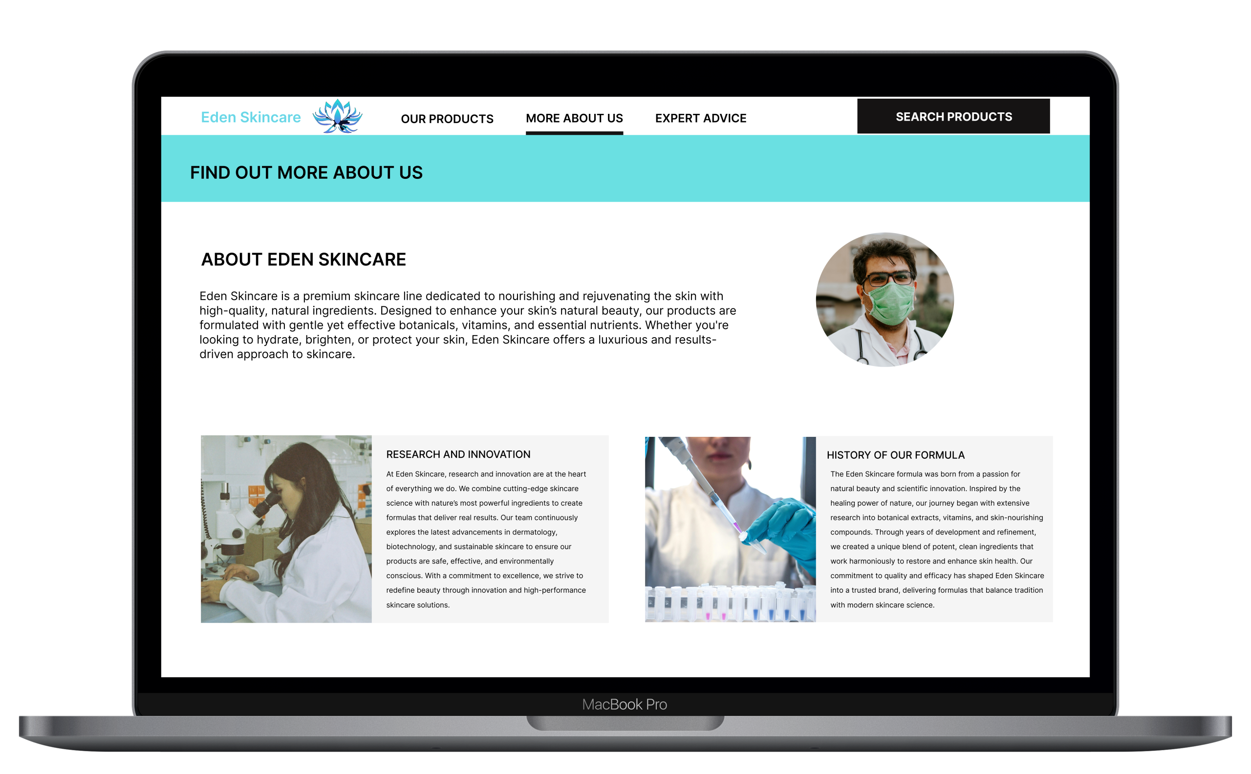
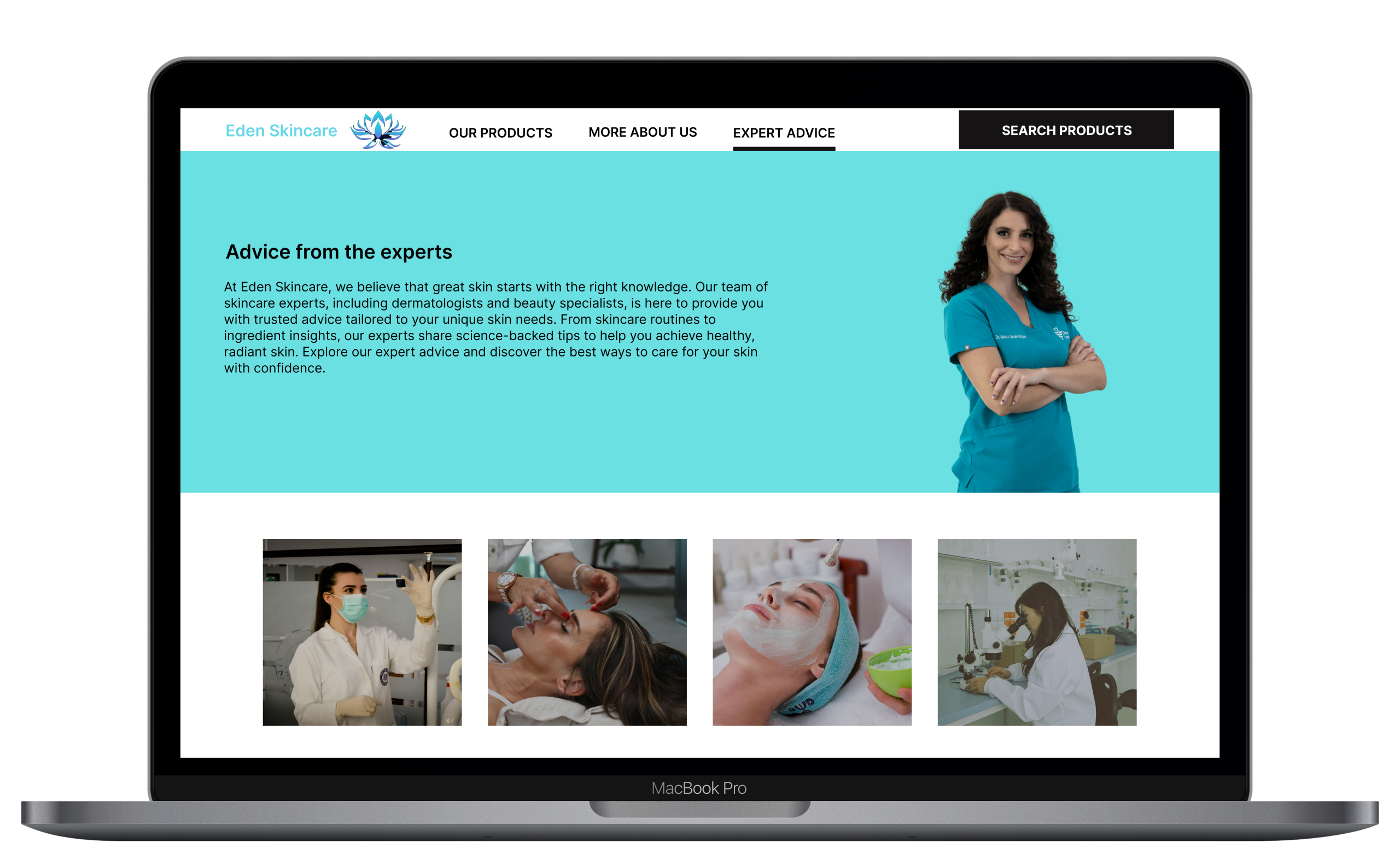
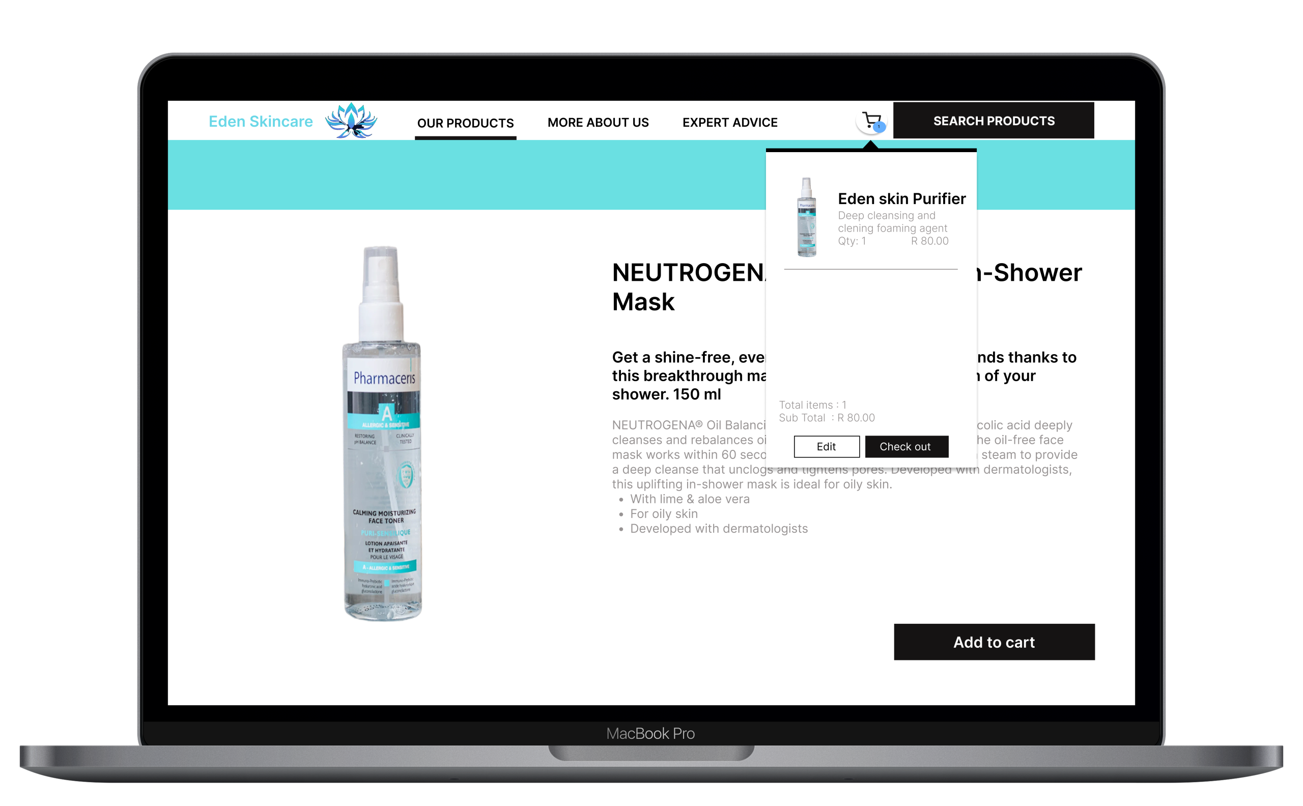
Eden Skincare

Project Overview
Eden Skincare is a beautifully designed app and website that offers a curated space to discover, learn about, and shop premium skincare products. With a focus on expert-backed advice and high-quality, ingredient-conscious formulations, Eden Skincare connects users to trusted voices in the industry through videos, articles, and product insights. Whether you’re building a new routine or simply looking to upgrade your skincare shelf, Eden makes it easy to explore what works best for your skin, all in one calming, easy-to-navigate platform.
Design Process


User research summary
To guide the development of Eden Skincare, we conducted user research with a diverse group of participants who actively engage with skincare products and online beauty content. The goal was to better understand users’ shopping behaviors, informational needs, and expectations from a skincare platform.
Key Insights:
-
Expert Guidance is Valued: Users expressed a strong desire for trustworthy, professional advice. Many felt overwhelmed by the volume of skincare information online and appreciated the idea of hearing directly from qualified experts.
-
Product Discovery Should Feel Curated: Participants wanted a more thoughtful shopping experience, preferring platforms that recommend products based on skin goals, ingredients, or expert curation rather than endless scrolling.
-
Design Impacts Trust: Clean, calming design aesthetics were consistently associated with trust and professionalism. Users are drawn to platforms that feel elevated, minimal, and wellness-oriented.
-
Mobile First Design: Most users reported browsing and purchasing skincare primarily on their phones. As such, ease of use, fast load times, and mobile optimised interfaces are critical.
-
Education Drives Purchase: Users appreciated content that educates them about ingredients, skin types, and proper usage. Many said they’re more likely to buy a product when they understand its purpose and benefit.
This research has directly informed Eden Skincare’s approach prioritising expert-driven content, streamlined product discovery, and a visually soothing, mobile-friendly user experience that builds trust and simplifies the skincare journey.
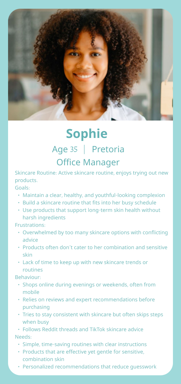
User Personas

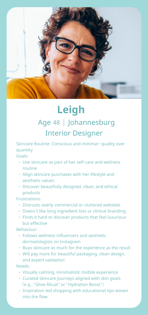
Usability study
1. Overwhelming product listings
What we found:
Users reported feeling overwhelmed when browsing the product catalogue due to lack of filters and personalized recommendations.
Pain point:
” There are so many products, I don’t know where to start or what’s right for my skin.”
Strategy:
Implement smarter filtera ( by skin concern, ingredients and expert links ). Introduce a short skin quiz for tailored suggestions.
2. Expert content accessibility
What we found:
While users were excited about expert videos and advice, many had trouble locating this content easily within the app.
Pain point:
” I saw there were expert tips, but I couldn’t find them again later.”
Strategy:
Highlight expert content on the homepage and integrate it contextually into product pages for better visibility.
3. Lack of ingredient information
What we found:
Skincare-conscious users wanted to see more transparent ingredient breakdowns and benefits of each product.
Pain point:
” I want to know what’s in the product and why it’s good for my skin, but it just shows a name.”
Strategy:
Add expandable or new screen ingredient lists and explanations and icons showing the key benefits.
High-fidelity prototypes
Mobile

Tablet

Desktop

Usability study findings
The usability study conducted on the low-fidelity prototype focused on evaluating how users experienced the app’s overall flow and navigation. Participants found the structure clear and appreciated the step-by-step progression from onboarding to personalized product recommendations. Most users easily understood the purpose of each screen and felt that the quiz at the beginning made the experience feel tailored and relevant. The navigation between sections such as moving from product discovery to routine management—was described as intuitive and well-organized. A few users noted that certain buttons or icons in the wireframes could be more prominent or clearly labeled, especially in the “My Routine” and “Expert Tips” sections. Overall, users responded positively to the simplicity and logic of the flow, with suggestions centered on improving visual cues and labeling to enhance usability in future design iterations
Styleguide

Final product
Mobile


Tablet


Desktop

