Wine With Me
Project Overview
Wine With Me is a user-friendly platform that allows wine enthusiasts to discover and book wine tastings at top wine farms. With an easy search function, users can explore vineyards, check availability, and secure reservations all in just a few taps. Whether planning a weekend getaway or a spontaneous tasting, this app makes finding the perfect wine experience effortless.

My Work
This case study showcases my very first project in the Google UX Design Proffesional Certificate course. Through this process, I have gained valuable insights about the design process and effective work.
Responsibilities
I was responsible for all aspects of this projects starting with researching the users, stating user needs and problems, creating ideas, low and high fidelity designs, mockups, prototypes and the final designs.
Design Process


Understanding the user
- User research
- Persona
- Problem statements

User research summary
I conducted user interviews, which I then turned into empathy maps to better understand the target user and their needs. I discovered that many target users are very excited to have a break or go on a getaway weekend or vacation and want to be able to make bookings effortlessly while planning their trip. However, many websites do not offer the a booking service for wine tastings on their wine farms and to get in contact with them via email or phone are overwhelming and confusing to navigate having to go back and forth on email to try and make a booking, which frustrated many target users. This caused a normally enjoyable experience to become challenging for them, defeating the purpose of the excitement and relaxation.
User persona

Pain points
1
Users are unable to book wine tastings on wine farm websites directly.
2
Users are not aware of all wine farms, do not know the areas or what to search for.
3
Navigation to get in contact with a wine farm is confusing and time consuming.
Design
- Sitemap
- User journey
- Paper wireframes
- Low-fidelity prototypes
- Usability studies
Sitemap

Paper wireframes

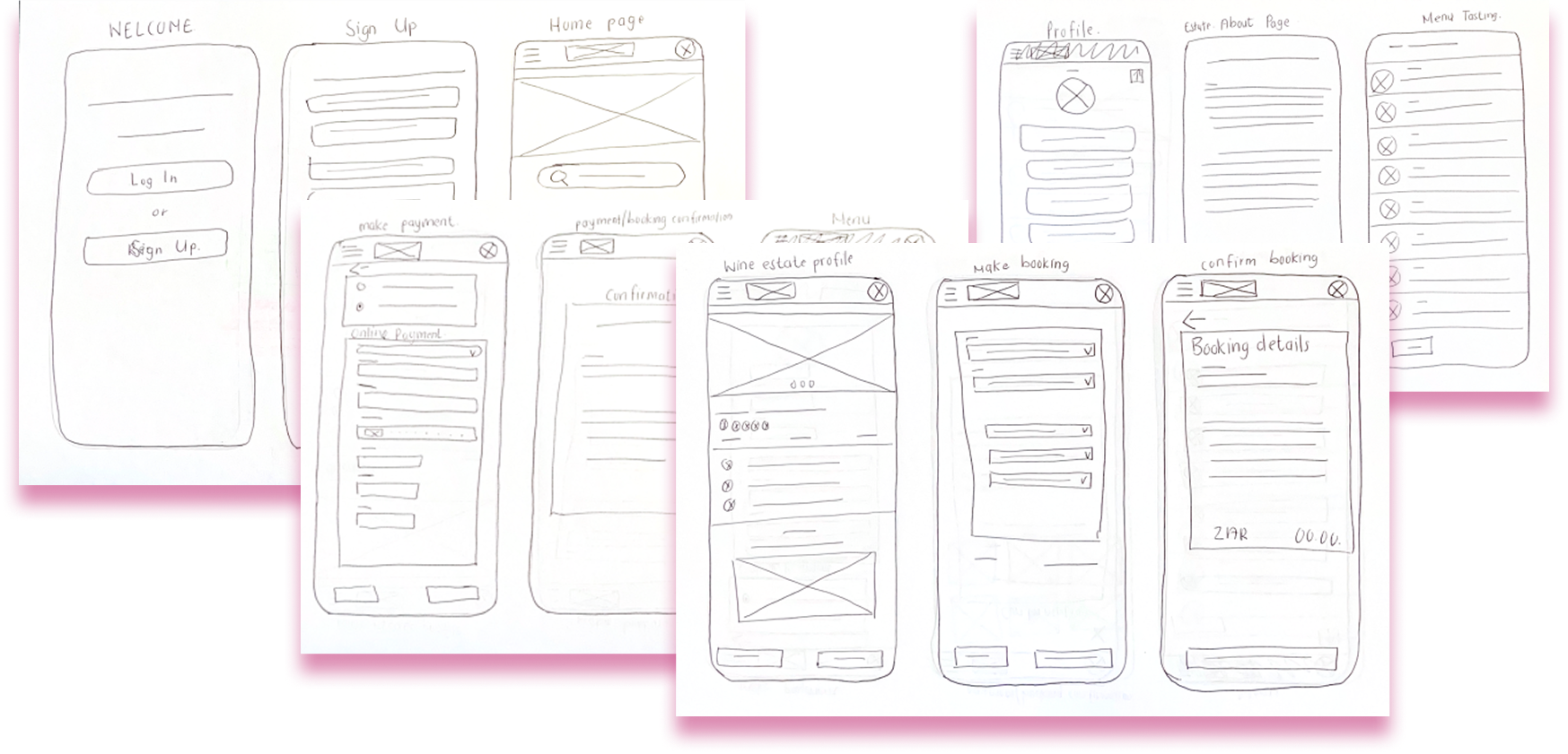
I sketched out paper wireframes for each screen in my app, keeping the user pain points about navigation, bookings, and payment flow in mind.
The home screen paper wireframe variations to the right focus on optimizing the browsing experience for users.

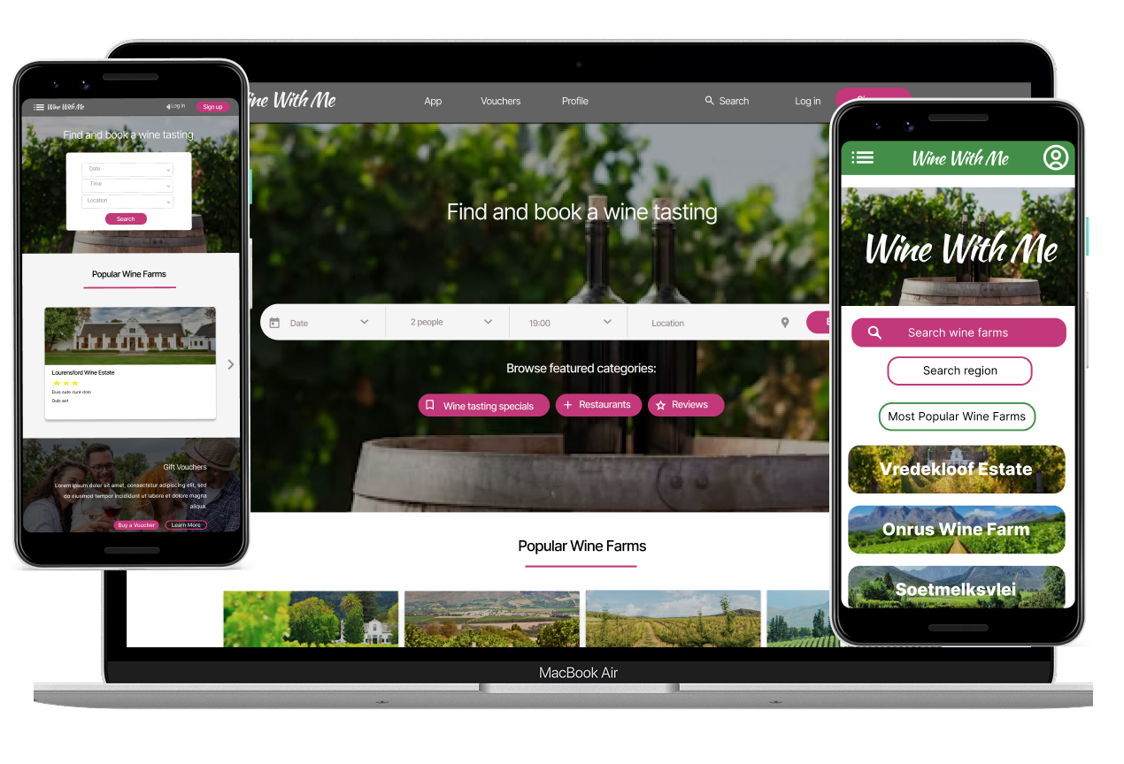
Because Wine With Me customers access the site on a variety of different devices, I started to work on designs for additional screen sizes to make sure the site would be fully responsive. These include desktop, tablet and mobile devices.
Low-fidelity prototypes

The homepage is the key part for how the user experience will start and continue.Moving from paper to digital wireframes made it easy to understand how the redesign could help address user pain points and improve the user experience.
I prioritized useful button locations, recommendations and carousels at the top to make it easy and quick for the user..
I included considerations for additional screen sizes in my mockups based on my earlier wireframes. Because users use a variety of devices, I felt it was important to optimize the browsing experience for a range of device sizes, such as computer,mobile and tablet so users have the smoothest experience possible.
Usability study
Study type:
Unmoderated usability study
Location:
South Africa, Remote
Participants:
5 Participants
Duration:
20 – 30 minutes
Usability study findings
1
Payment options
Some users preferred to have the option to pay at venue as well.
2
Booking details
Users wanted to view booking details again before confirming, booking details downloadable and users wanted more options to choose from while adding their personal details.
3
Findings
Users prefer clear and simple steps to follow while making a booking.
Refining the design
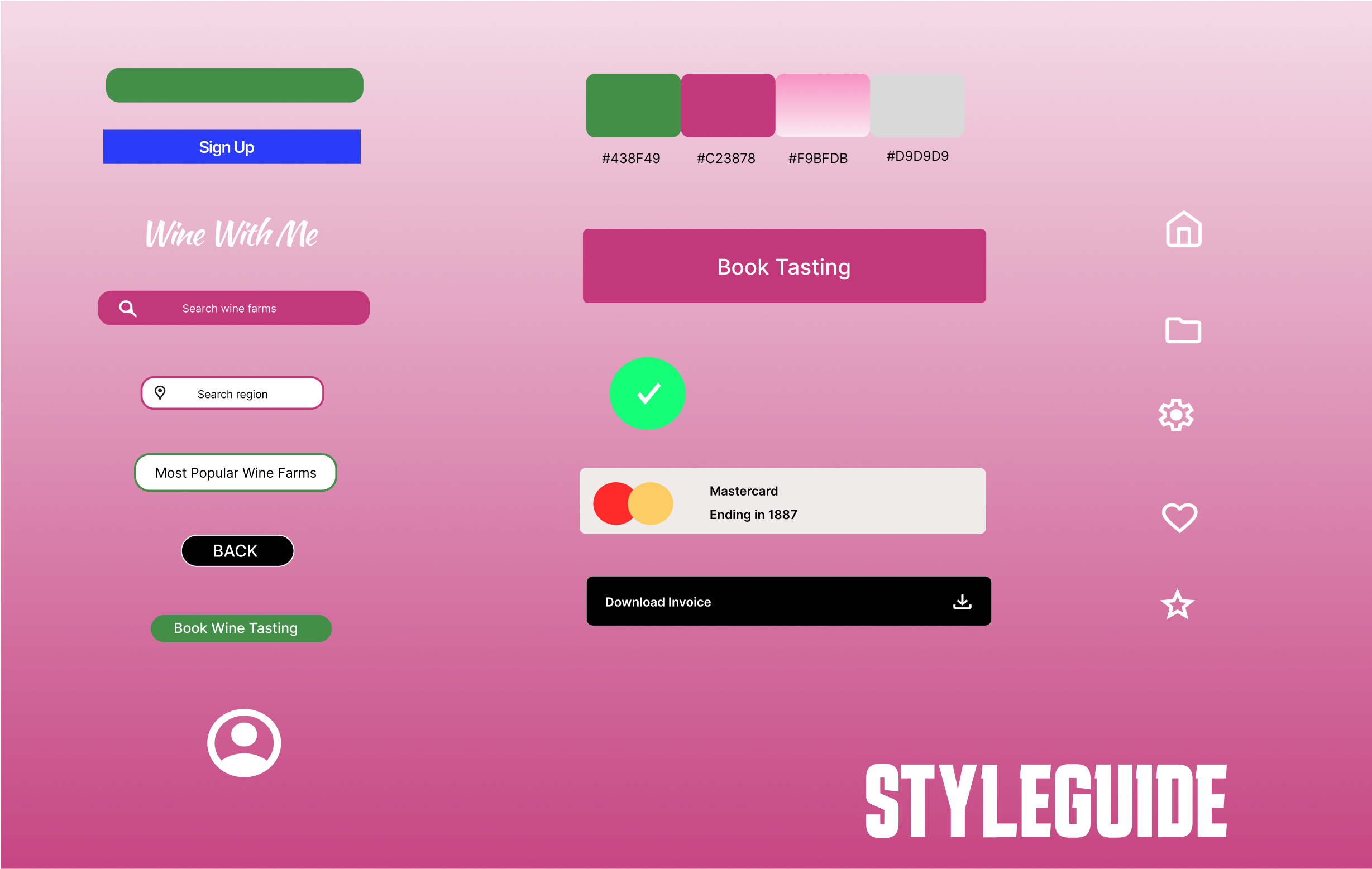
- Styleguide
- High-fidelite product
Styleguide

High-fidelity Prototypes


